Bad Websites Examples: 20 Worst Website Designs
Looking examples of bad websites to learn from? We have compiled a list of badly designed websites that need help.
See Our Work Get a QuoteLooking for examples of the bad websites to learn from? We have compiled a list of badly designed websites that have a lot of room for improvement in their design or really just should be replaced.
Websites serve as a first impression for your business. While obvious features such as bad imagery, poor color choice, and outdated branding make for a badly designed website, we’ve also included a few examples of the bad websites that missed the mark on things such as user experience and content organization.
What makes for a badly designed websites?
Some qualities of a poorly designed website include the following:
- Bad image choices – Images that are unprofessional, off brand, pixelated, or wrongly sized can contribute to a poor website design. It is important that your choices for website imagery are cohesive and help tell your brand’s story. Images that are too large can also appear out of focus on some devices, as well as be distracting for the visitor. You also will want to consider avoidance of stock images whenever possible as these can come across as cheesy and outdated.
- Poor color and font choices – Along with bad websites, website imagery, the wrong color scheme or font choice for a website design might also contribute to a bad website design. Colors that are too bright might be distracting and look unprofessional. When it comes to font choice, it is better to stick to simple fonts that are easy to read rather than stylized and cursive font options.
- Cluttered content – There’s nothing worse than coming to a website for a quick source of information, only to find that the page you were looking for is cluttered with information and looks like it will take you 20 minutes to read. When it comes to content presentation, it is better to keep your messaging very straightforward. You also may want to break up your text whenever possible to make your content easier to read through use of multiple paragraphs, thoughtful use of images (avoid having too many if possible), and bulleted lists.
- Outdated branding – Having a website that does not align with your brand’s current image can also contribute to bad website design. You want to ensure that your branding remains relevant and professional to give your website a professional look and feel.
- A lack of responsive design – Smartphones and devices are part of life and it’s important that your website be responsive across device types. Website designs that are not optimized for use on mobile or other portable devices will likely cause visitor frustration from trying to zoom in and out on a webpage. This may lead to complete abandonment of your website for a competitor that has chosen to implement responsive design.
- Bad navigation – A website design that lacks simple navigation is also very frustrating for visitors. If your website has too much content, visitors might not be able to find important information. A website with too many pages that take too long to navigate can also contribute to other issues such as slow website performance.
- Links or buttons that do not work – Some websites have broken links that might lead to web pages that are no longer in use. By forgetting to remove these buttons or webpages, visitors might become confused thinking that there is something wrong with the website, or the device they are accessing it from, and abandon it entirely.
Below are some of our choices for bad to worst websites:

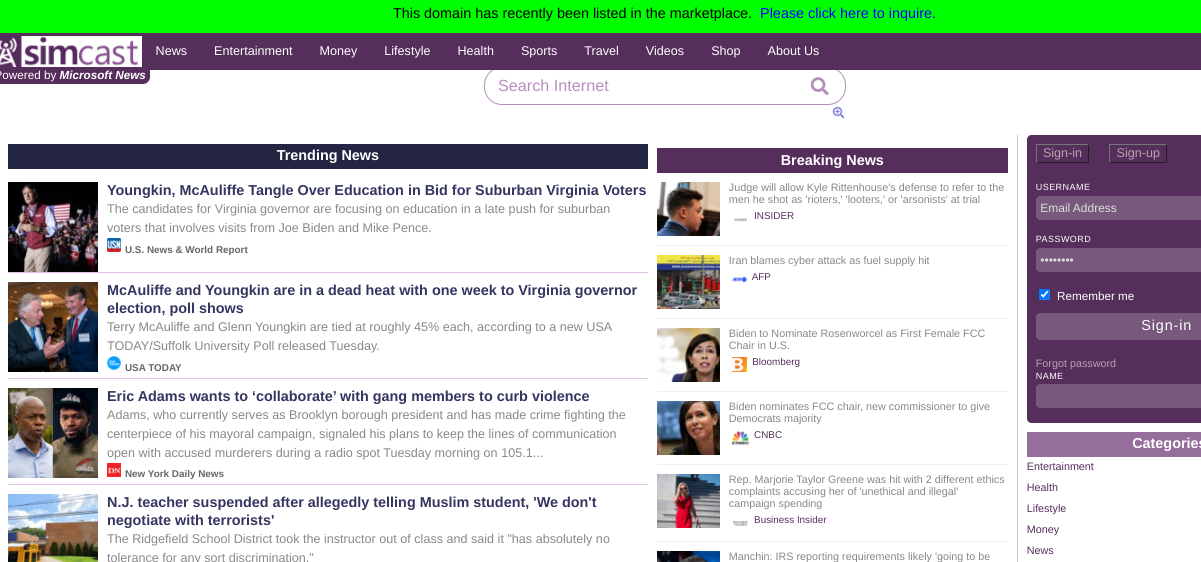
amisdubeauceron.org
- Way too many images
- Outdated look and feel
- No introduction about the business
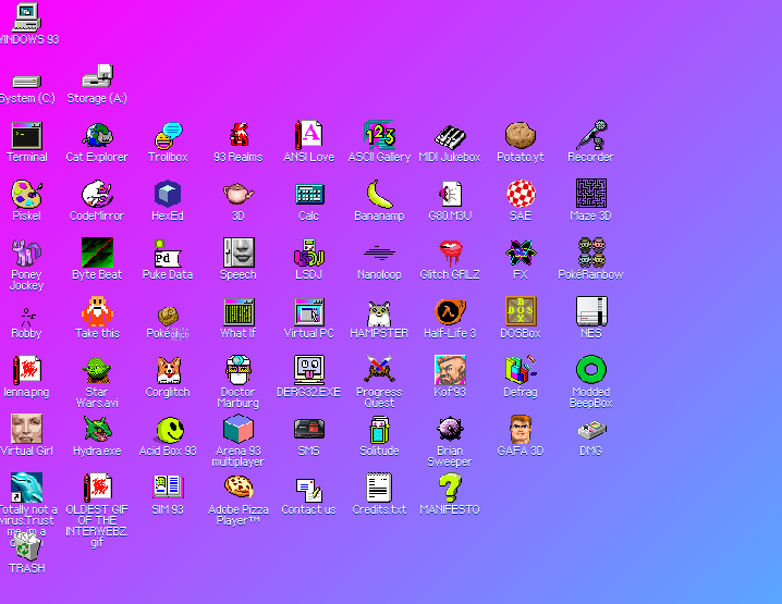
windows93.net
- Design and graphics are straight out of the 90s
- No text or inofrmation about the website; just images
- Strong background color

spacejam.com
- Outdated look and feel of the homepage
- Color choices are a bit distracting
- Lacks media or other engaging elements for a movie website design
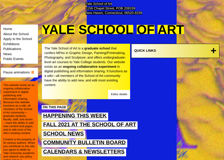
art.yale.edu
- Uncoordinated background color choices
- Text is broken up and not well-placed on the page
- Lacks a professional look and feel with no branding included in the design
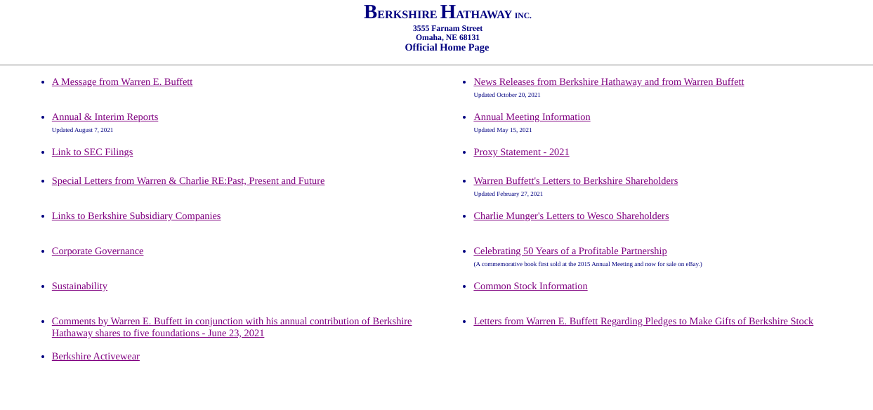
berkshirehathaway.com
- Has no website imagery
- No background color
- Overall feel of the website is very basic and does not convey the brand image

yvettesbridalformal.p1r8.net
- Distracting color scheme
- Image choices are not relevant to the brand
- Too many different font styles
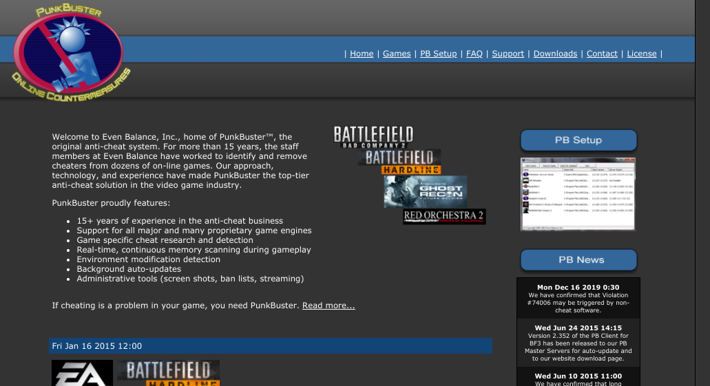
evenbalance.com
- Dark background
- Font is too small
- Choice of graphics are outdated and somewhat pixelated

cloud9walkers.com
- Unclear choice of images
- Too many different fonts
- Background choice is distracting
- Lacks use of multiple web pages
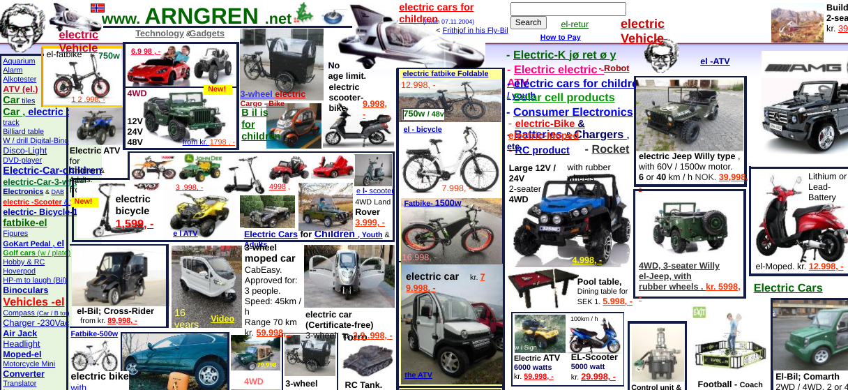
arngren.net
- Too many images
- Challenging to find information
- No homepage introduction about where the company is located and what they specialize in
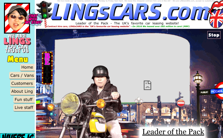
lingscars.com
- Odd choice of imagery
- Background is distracting
- Homepage menu is unspecific
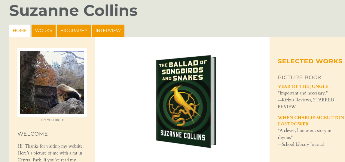
suzannecollinsbooks.com
- Website design is very basic; no branding, minimal text and no background
- Poor image choices
- No background on the author; homepage just links directly to her books
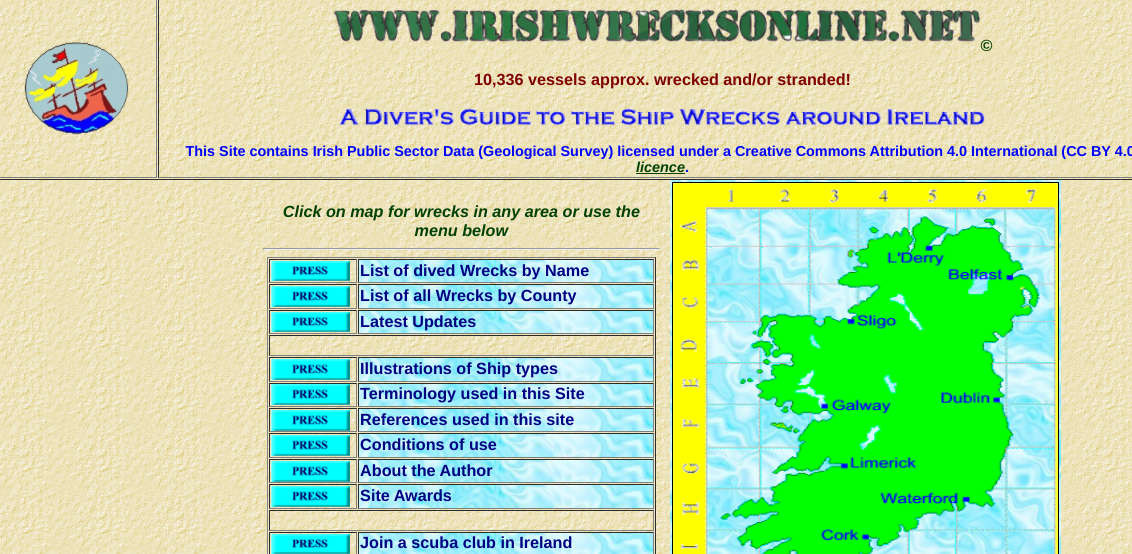
irishwrecksonline.net
- Very basic homepage with strange color choice
- Cartoon image choices
- Too many bright colors

industrialpainter.com
- Weird image choices
- Outdated look and feel
- Background is very dark
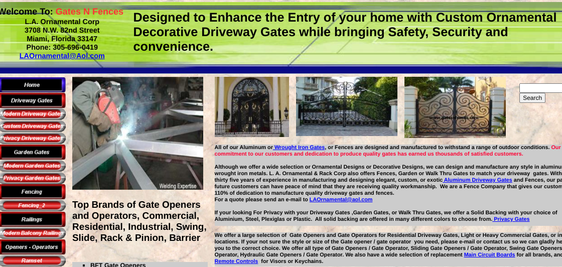
gatesnfences.com
- Cluttered with too much text
- Images are small
- Color scheme is uncoordinated

pnwx.com
- No company information or introduction
- Search bar is oddly designed and placed
- Lacks use of relevant imagery
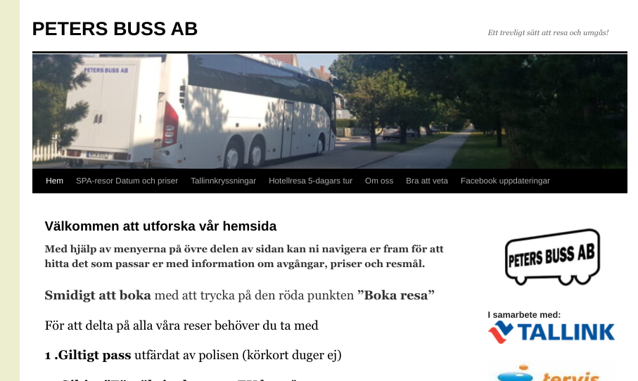
wordpress.petersbuss.se
- Images are blurry
- No branding
- Lack of visual interest; no background colors or graphics to break up text
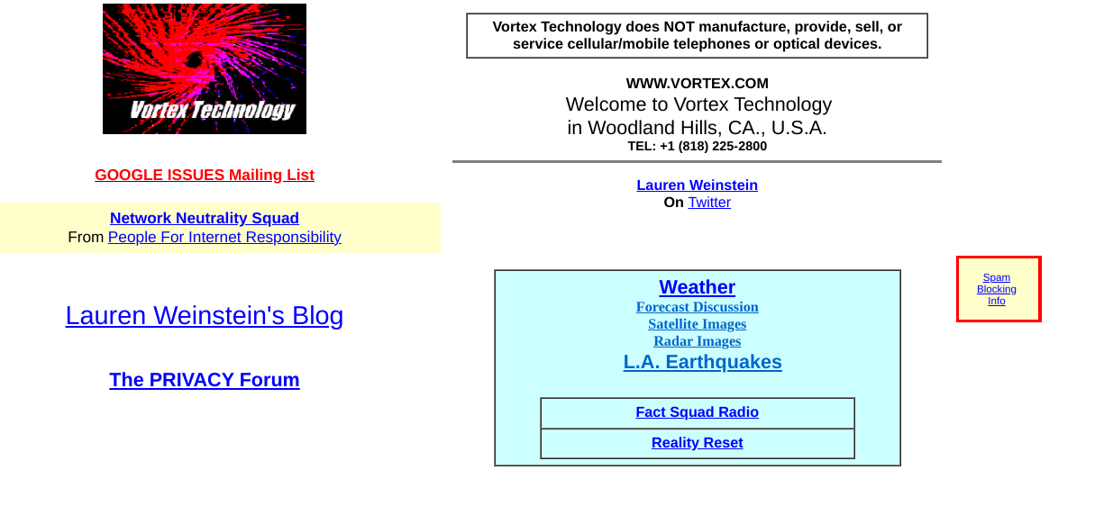
Vortex Technology
- No background style
- Random color choices
- No style elements or navigational components
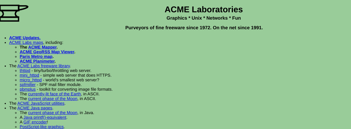
acme.com
- No branding or imagery
- No navigational components, only hyperlinks
- No background imagery, just a flat green color

theworldsworstwebsiteever.com
- Shows everything that makes a bad website design
- Distracting background, multiple fonts, and a crazy color scheme
Use these bad website examples as a springboard to avoid developing the layout, color palette, imagery, and animations on your website. And if you found an candidate for worst websites, please send us a link here.
Need some help with your website design?
Alliance Interactive is a digital web design, web development, and website maintenance agency. We can give your brand a professional look and feel with a new custom-built, responsive website design that will engage your visitors. Give us a call today at 888-222-9056 or contact us here.